You may wonder how and why are logos made. They are actually for identification. Most of them are made simple but memorable; and despite the simplicity, they convey meaning that is derived from the quality of those which they symbolize. The following logos have revelations in themselves. Scroll down and find out...

Unilever is one of the biggest producers of food, beverages, cleaning agents and personal care products. Their logo is letter U, the initial of the company's name. But it is not as simple as it looks because it took many shapes to form this letter. Each shape speaks something about a particular product offered by the company itself.
|
 Designed by Professor Vaughan Pratt of the Stanford University, the Sun logo is one of the most famous ambigrams in the world. In it, you can read the brand name whether in vertical or horizontal direction. |

Have you seen letters N and W? They are inside the circle.
But aside from these letters, you can also see the compass pointing to northwest, another reference to the brandname. Look again...
|
 The logo is a green tree. But it isn't just a mere tree. Looking at its crown, you will notice that it resembles a brain. It symbolizes the intellectual capabilities of the firm's staff and to underscore their company's name. |

What have you seen? Focus at the center. There you can see two persons sharing a piece of Tostito chip with a bowl of salsa. It conveys an idea of people connecting with each other.
|
 |
Elefont has only letter "e" logo. This actually looks so simple; but try to look at it more closely and you will see a part of an elephant's trunk in its negative space.
|
 |
The Milwaukee Brewers is a professional baseball team from Milwaukee, Wisconsin. That is why, as you can see, their logo also looks like a baseball glove. But actually they are letters M and B, the initials of the team's name.
|
 |
Toblerone is a chocolate-company from Bern, Switzerland . Bern is sometimes called The City Of Bears . They have incorporated this idea in the Toblerone logo, because if you look closely, you'll see the silhouette of a bear.
|
 |
The NBC (National Broadcasting Company) is one of the biggest American television networks. The logo shows six different tail feathers of a peacock that refer to the six divisions at the time that this logo was created. The peacock's head is flipped to the right to suggest it was looking forward, not back.
|
 |
Every letter in this logo is formed number 8. This is simple yet memorable. |
 |
At first glance, you will only notice letter F and the red stripes in the logo.
But if you look closely in the negative space between them, you can see number 1.
|
 |
It's the logo of Carrefour, one of the biggest European retailers and also the French for "crossroads". No wonder why in this logo, there are two arrows in opposite directions and the letter C between them.
|
 |
This logo does not only contains letters B and R,
but also include 31 (in color pink), reference to the 31 flavors.
|
 |
Roxy is a company that specializes in clothing and accessories for girls who love snowboarding, surfing. The company is actually a part of Quiksilver (right). The Roxy logo (left) is made of two Quiksilver logos that form a heart.
|
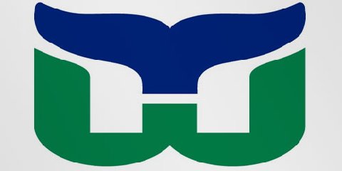 |
| This logo also uses a negative space to create the letter H. You can see three different parts: the letter H and W and a whale's tail in blue. |
 |
| This logo doesn't seem to hide much at first sight, but it gives you a little insight in the philosophy behind the brand. First of all, the yellow swoosh looks like a smile: Amazon wants to have the best customer satisfaction. The swoosh also connects the letters a and z, meaning that this store has everything from a to z. |


.jpg)


